TL;DR:
- A landing page is a standalone web page designed for a single campaign with one clear call-to-action. It relies on message match, minimal navigation, and a focused structure to boost conversions. Founders use landing pages to validate offers, capture leads, and drive specific actions efficiently.
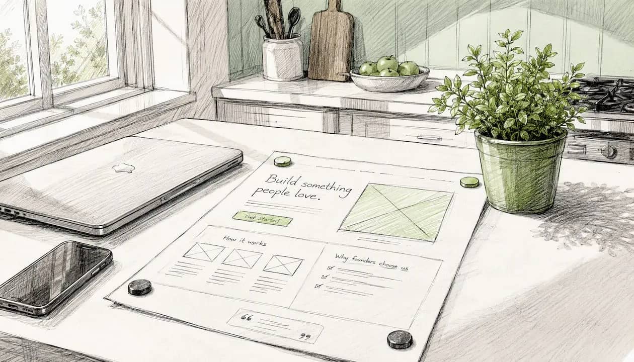
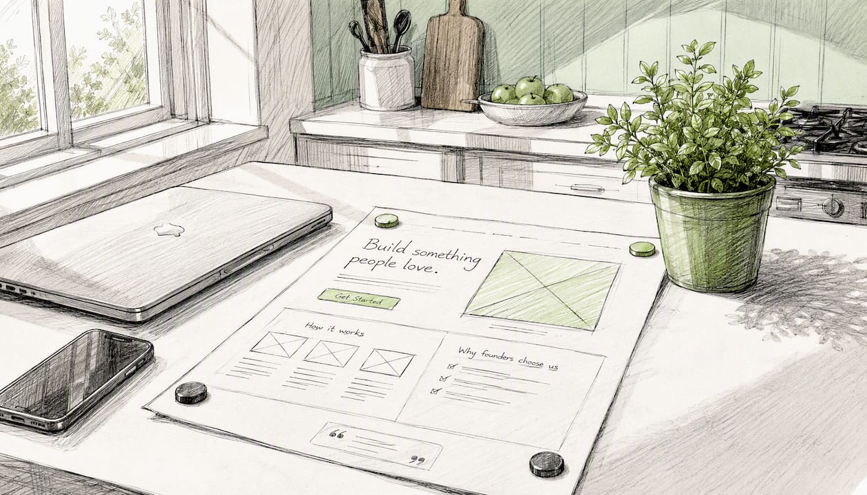
A landing page is a standalone web page built for a single marketing campaign with one specific goal: your Call-to-Action (CTA). Unlike a homepage, it strips away navigation, secondary links, and everything else competing for attention. Three things every founder needs at launch:
- Message match: your page copy mirrors the ad or email that sent the visitor there
- Single CTA: one unambiguous action, nothing else
- No navigation: remove the escape routes; protect your conversion rate
Table of Contents
- Why landing pages beat a homepage for founders
- The five building blocks every high-converting page needs
- Which landing page type fits your experiment?
- Design and conversion practices that actually move the needle
- How to measure, test, and validate your page
- Your launch checklist and one-page template
- Key Takeaways
- The brochure trap — and how to avoid it
- siift helps you design better experiments, faster
- Useful sources
- FAQ
Why landing pages beat a homepage for founders
Your homepage is a lobby. A landing page is a sales conversation. When traffic arrives from a paid ad, an email campaign, a partnership, or a QR code, visitors expect to land somewhere that continues the promise that brought them there. A homepage can’t do that reliably because it speaks to everyone at once.
Founders use landing pages for three core jobs: validating an offer before building it, capturing leads in exchange for something valuable, and driving a single conversion event like a signup, download, or purchase. A pre-launch waitlist page for an MVP, a webinar registration form, a “get early access” page for a SaaS product — these are all landing pages in action.
Pro Tip: Before you write a single line of copy, write the ad or email first. If your landing page can’t finish that sentence, rewrite the page.
The five building blocks every high-converting page needs
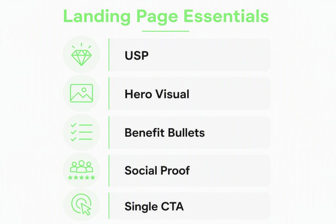
High-converting landing pages share the same anatomy, regardless of industry or offer. Miss one block and the whole structure wobbles.
-
Unique selling proposition (USP) / headline. Your headline is the first and sometimes only thing visitors read. Keep it under 10 words and make the benefit unmistakable. A simple formula: [Outcome] for [Audience] without [Pain]. Your value proposition lives here.
-
Hero visual. A product screenshot, a short 30–60 second demo video, or a single image that shows the outcome. Visuals do the heavy lifting when words can’t.
-
Clear benefits (3–5 bullets). Not features — outcomes. “Save 3 hours a week” beats “automated scheduling.” Keep each bullet to one line.
-
Social proof. A testimonial, a logo bar, a review count, or a metric. Collecting the right testimonials and placing them near the CTA is one of the highest-leverage moves on any page.
-
One unambiguous CTA. Benefit-driven button copy like “Get my free plan” or “Start my trial” consistently outperforms generic labels like “Submit.” One button. One destination.
Pro Tip: Run a headline A/B test before anything else. It’s the highest-leverage variable on the page and takes 20 minutes to set up.
Which landing page type fits your experiment?
| Type | Primary CTA | Best for | Funnel stage |
|---|---|---|---|
| Lead-gen | Form submission | Email list, gated content | Top of funnel |
| Click-through | Button to next step | Warm-up before checkout | Mid funnel |
| Coming-soon / waitlist | Email capture | MVP validation, pre-launch | Pre-funnel |
| Long-form sales | Purchase or book a call | High-consideration offers | Bottom of funnel |
| Event / webinar | Register now | Audience building, demos | Top/mid funnel |
For rapid validation experiments, a coming-soon or lead-gen page is almost always the right starting point. You’re testing demand, not closing deals. Match the page type to where your visitor is in the decision process, and match it to the channel that sent them there.
Design and conversion practices that actually move the needle
Message match is the single most underrated conversion lever. If your Facebook ad says “Double your leads in 30 days” and your landing page headline says “Welcome to our platform,” you’ve already lost the visitor. The copy, visuals, and offer must feel like a continuation, not a redirect.
Beyond copy alignment, friction reduction often matters more than any headline tweak. HubSpot’s guidance points to removing design and interaction obstacles as the first priority. That means:
- Strip global navigation and footer links
- Cut form fields to the minimum (name + email is usually enough)
- Compress images and defer non-critical scripts to hit Core Web Vitals targets
- Test on mobile before you launch — most ad traffic arrives on a phone
86% — the lift in conversion rates that including an engaging video can produce on a landing page (Constant Contact, 2022). A 30-second demo beats a wall of text almost every time.
Layout guidance from Mailchimp suggests a clean horizontal split: USP and primary CTA in the upper two-thirds, social proof and secondary reassurance below. That maps to how visitors actually scan a page.
Pro Tip: Check your page on a real phone, not just a browser emulator. Tap targets, font sizes, and form fields behave differently on actual hardware.
How to measure, test, and validate your page
Tracking five metrics covers most of what founders need to know early:
| Metric | What it tells you | Tool |
|---|---|---|
| Conversion rate | % of visitors who complete the CTA | Google Analytics 4, Plausible |
| Bounce rate | % who leave without interacting | GA4 |
| Time on page | Engagement depth | GA4, Hotjar |
| Form completion rate | Drop-off in multi-field forms | Hotjar, Typeform |
| Channel ROI | Which acquisition source converts best | UTM parameters + GA4 |
The testing workflow is straightforward: form a hypothesis (“Changing the CTA from ‘Sign up’ to ‘Get my free plan’ will increase clicks”), change one variable, and run the test until you have enough data to trust the result. Heatmaps and session recordings reveal where visitors hesitate before you ever run a formal A/B test — they’re the fastest way to find what’s broken.
Early signals are noisy. Don’t declare a winner on 50 visits. Wait for at least a few hundred sessions per variant before drawing conclusions.
Pro Tip: Set up UTM parameters before you launch. Without them, you can’t tell which channel is actually converting, and you’ll optimize blind.
Your launch checklist and one-page template
One-page template (clone this for every experiment):
- Headline / USP — outcome-focused, under 10 words
- Subhead + 3 benefit bullets — what they get, why it matters
- Hero visual — product image or 30–60 second demo video
- Social proof — one testimonial or a metric near the CTA
- Single CTA button — benefit-driven copy, high-contrast color
- Minimal footer — privacy policy link only; no navigation
Pre-launch checklist:
- Tracking pixel and GA4 installed and firing
- UTM parameters set for every traffic source
- Message match verified against the ad or email creative
- Mobile test passed on a real device
- Page speed checked (target: under 3 seconds load time)
- Baseline conversion rate recorded on day one
In the first 72 hours, watch conversion rate and bounce rate. If bounce rate is above 70%, the message match or page speed is the likely culprit. Run your headline A/B first, then test CTA copy. Those two variables move the needle faster than anything else at this stage.
Key Takeaways
A landing page with a single CTA, strong message match, and the five core building blocks is the fastest way for founders to validate demand and capture leads before building anything.
| Point | Details |
|---|---|
| Definition and focus | A landing page is a standalone page with one CTA, distinct from a homepage, with no navigation to distract visitors. |
| Five core blocks | USP, hero visual, 3–5 benefit bullets, social proof, and one benefit-driven CTA are non-negotiable on every page. |
| Message match first | Align your page copy and visuals with the ad or email that sent the visitor — mismatch is the top cause of bounces. |
| Measure before optimizing | Track conversion rate, bounce rate, and channel ROI from day one; run headline and CTA A/B tests before changing anything else. |
| siift for validation | siift’s startup idea validation flow guides founders through experiment design, hypothesis creation, and go-to-market planning tied to landing-page tests. |
The brochure trap — and how to avoid it
Most founders build their first landing page like a company brochure. They explain the product, list every feature, add three CTAs “just in case,” and wonder why nobody converts. The page isn’t bad because it lacks design talent. It’s bad because it’s trying to do too many things at once.
The real purpose of a landing page isn’t to impress visitors. It’s to answer one question fast: “Is this for me?” If the answer is yes, the CTA should be impossible to miss. If the answer is no, the visitor should leave quickly — that’s useful signal too.
Common mistakes I see founders repeat: leaving global navigation intact (every extra link is a conversion leak), writing CTAs that say “Learn more” instead of naming the outcome, building long pages for cold traffic that needs a short page, and skipping heatmaps entirely. The fix for all of them is the same: one goal, one page, one test at a time.
AI-guided platforms change this loop meaningfully. When you’re designing a validation experiment, having a system that helps you structure your hypothesis, avoid cognitive bias, and connect your landing page to a broader go-to-market strategy cuts weeks off the learning cycle. That’s the real leverage.
siift helps you design better experiments, faster
Founders who use siift’s go-to-market planning flow get a structured path from raw idea to validated experiment, including the hypothesis framing, channel selection, and messaging architecture that feeds directly into a landing page brief. Instead of starting with a blank page and a guess, you start with a tested strategic frame.
Run the two experiments from the checklist above — headline A/B and CTA copy test — inside siift’s validation workflow and you’ll have early signal within 72 hours, not 72 days. The platform is built for founders who want clarity and speed, not another tool that adds complexity. Try siift’s startup idea validation flow and run your first experiment today.
Useful sources
- What Is a Landing Page? | Unbounce — core definition and the case for removing navigation; start here.
- The Anatomy of a Landing Page | Unbounce — detailed breakdown of each page element and CTA copy guidance.
- What Makes an Effective Landing Page? | Constant Contact — source for the 86% video conversion lift and the five core building blocks.
- Landing Page Best Practices | HubSpot Blog — friction reduction and design obstacle guidance.
- Landing Pages Design Tips | Mailchimp — upper-2/3 layout guidance and visual hierarchy.
- What Makes a Good Landing Page? | Moosend — message match, heatmap use, and iterative A/B testing workflow.
- How to Craft Effective CTAs for Higher Conversions in 2026 — practical CTA wording and test frameworks for tech buyers.
FAQ
What is a landing page in simple terms?
A landing page is a standalone web page built for one campaign goal, with a single CTA and no navigation to distract visitors. It converts traffic from ads, emails, or QR codes into leads or customers.
How is a landing page different from a homepage?
A homepage serves all visitors and covers the full business. A landing page targets one specific audience segment with one specific offer, making it far more effective for campaigns.
What makes a good landing page?
The five essentials are a clear USP, a hero visual, 3–5 benefit bullets, social proof, and one benefit-driven CTA. Message match between your ad and your page is equally critical.
How do I know if my landing page is working?
Track conversion rate, bounce rate, and form completion rate from day one. Run a headline A/B test first, then test CTA copy, and use heatmaps to find where visitors drop off.
Can I use a landing page to validate a startup idea?
Yes. A coming-soon or lead-gen page with an email capture is the fastest way to test demand before building anything. siift’s startup idea validation flow is built specifically for this experiment type.